getting booked for a specific style: illustrations for start up riskine
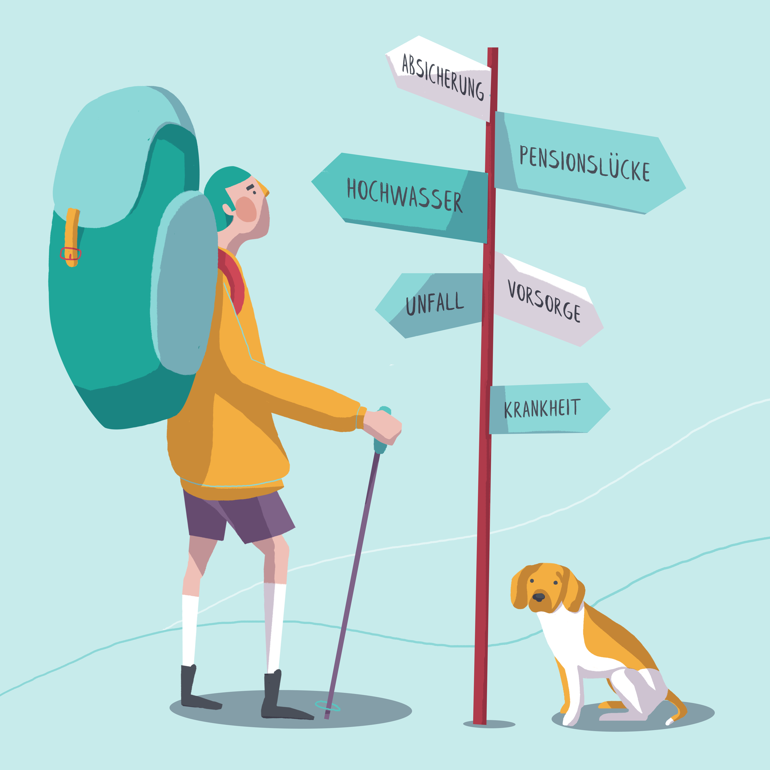
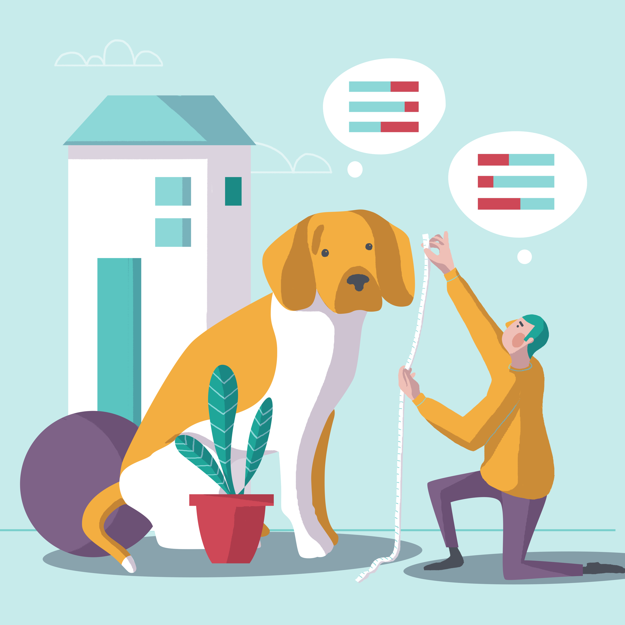
About 2 months ago an Austrian startup called riskine asked me to do some illustrations for them to help them visualize the steps of their process. I, of course, said yes until I heard that the had a very specific style in mind. A style I had done for another start-up called talentry. It was lovely to her that they had fallen in love with the characters, but it always feels strange to me, that people want exactly what they had seen somewhere else instead of aiming for an individual look. But it also makes sense, because companies collaborate with creatives because they are having a hard time to imagine what the output could be. When this situation occurs I always try to deliver something that is better and on point for the brand, does not copy the referenced style and that comes up with something unique for the company. A style that fits the story they want to tell and that helps to get across their ideas and the character of the company. Fortunately, the guys and girls and riskine fell in love with the style frames I came up with for their company and did not think twice. And even if there are some similarities in style it is a custom made visual world.
set of character for talentry
first styleframes for riskine
It is an ongoing discussion whether creatives should stick to one style only or whether one should be able to deliver different styles. Most probably the first one is smart if you want to get booked regularly and stay in people's heads for this specific style. Though I am more for the 2nd way because I truly believe that, I personally am an art director and brand designer, that always strives to find the core positioning and character of a brand. Once that is found, the visual world comes with it and it should be unique every time. So I enjoy to create different worlds for different brands and if I am not capable of doing a style that suits the brand I am happy to find the best illustrator for it.


