GEA / WALDVIERTLER: A project raising the question of a designers role.
About a year ago I was asked to help GEA / Waldviertler with their branding and mainly web design/e-commerce. Not knowing what was going on behind the curtains, I suddenly was faced with the fact, that Heini Staudinger, the founder of GEA and Waldviertler, had been working on a new website and shop for a year. The outcome: the so-called web design and developing company had built something for a good amount of money that did not work properly and did not look like it belonged to the 21st century. So the starting point was lots of frustration and the (big) handicap, that we HAD to work with the existing wireframe and some parts of the code that already existed.
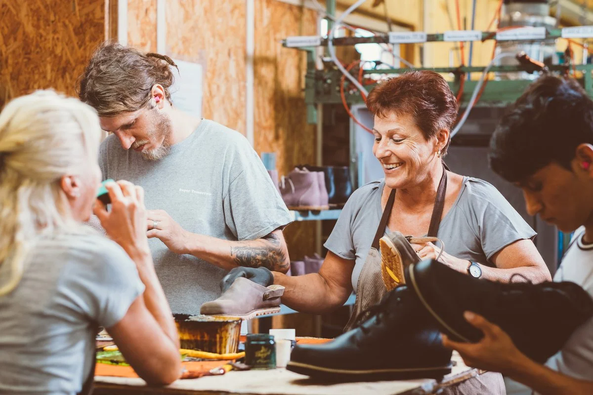
To be honest, I had to think about it at least three times, before I said yes to helping them. But I did. Here is why: First of all, I love Heini and his approach to business, being a super social human being and a political activist like no other. Second, I wanted to get off my high horse and do what I preach so often: to be a problem solver through design and not only create beautiful pictures. So we started the whole project by dissecting what was possible and what not, what where the needs, the content and the options for the people who would fill the site with life. Luckily, I had the guys from stereochrome by my side, who acted as an online strategy and content making consultancy, that pretty much lived at the GEA workshops for a while.
Out of the whole process, a site evolved, that is "not really a shiny design case" (from a critical designers perspective) - but the site works and the shop is hitting big numbers every month since the launch. There is only so much we could do, but what we could do, we did.
I thought about it a lot and whether I should write about this project or not but cases like these show so much about what is happening in this industry, how quickly we judge books by their cover and how easy it is to create new things but how hard it is to solve difficult things. I truly believe as an identity/brand designer you are offering a service that is not only based on the fact that you start from scratch but that you most of the times have to deal with existing circumstances that are not ideal, to begin with.
That said, a couple more learnings and takeaways were:
1. this is the best example why strategy, conception, wireframing and prototyping has to come before the design process even starts.
2. there are very different kinds of "professionals" out there so you better make sure you know what every team member or the company you partner up with is capable of.
3. as a designer you always also have to educate your client and share as much knowledge as you can. At least be open to it and don't assume knowledge that might not be there. All of that may lead to better design.
4. be free from expectations - always and in general.
5. be very reflective and aware of your role as a designer in a project and what you want to get out of the job/collaboration. For me, this one was not about winning a design award, it was about dirty, hands-on work and solving a puzzle through design.
In the end, I am honest enough to say that this won't become a case study, because I am aware of the fact, that my clients buy into seamless packages of conception AND design execution and I would have started the whole thing differently. But, the site is a "well-oiled machine" that delivers to it's needs and even if I don't love the look of it - it helped the company tremendously.
p.s.: check out the new sneaker collections it's quite something!
© photo credits: michael rottmann

