The evolution of a corporate (mini) identity. With all it's steps.

People have been coming to me saying: "I hear you can do nice logos" for years now. My response is always the same: "Yes I can, but I'd rather help you develop an identity for your venture, that can live and grow for years and that stands for something." Only through talking to people in length, they realize that the visual world and identity of a company or business is way more than just a logo, symbol or a bunch of colors. It stands for their values, helps to transport their ideas and is basically their strategy visualized.
Over the years I have worked with all sorts of clients on their branding. From big corporate companies to institutions, NGOs, start ups and one-wo/man-shows. But the process is always pretty much the same for me and the team I work with: if you don't do your homework before starting the design process, it is only always going to be a nice logo. But if you start with research, do a proper strategic positioning of the brand within it's market, listen to the client and find out all you can there is to know, then you build the foundation for a design that goes beyond the logo, becomes a system that can evolve and that will grow to be an identity that is linked to the actions, rather than nice pics.
I could go on forever and write about this topic in great detail, but I thought it would be a nice to give people a look behind the curtains. So I try to recreate a process for a small brand and how it came to be.
Webtaste has been a client of mine for a couple of months now.
It is a start up that sets out to help gastronomical clients to become digital natives and to help them with digital marketing in general.
The founder came with a name and claim in mind already. First, we set down and discussed all the goals and expectations on both sides, then I went and did my research: on other companies with similar services, the market in general, potential clients, and their problems. The third step, was for my client to wrap his head around the "project brief" a sheet of boxes to fill in and work with, I created over the years. A tool that helps you define your goals, values, insights etc. With big companies, that becomes a workshop most of the time, to include everyone involved and to narrow down and agree on the main topics. The combination of the project brief the research and the insight of all the conversations then will become a brand positioning. This is the red thread that will guide and inspire any designer and any person involved through out the design process.
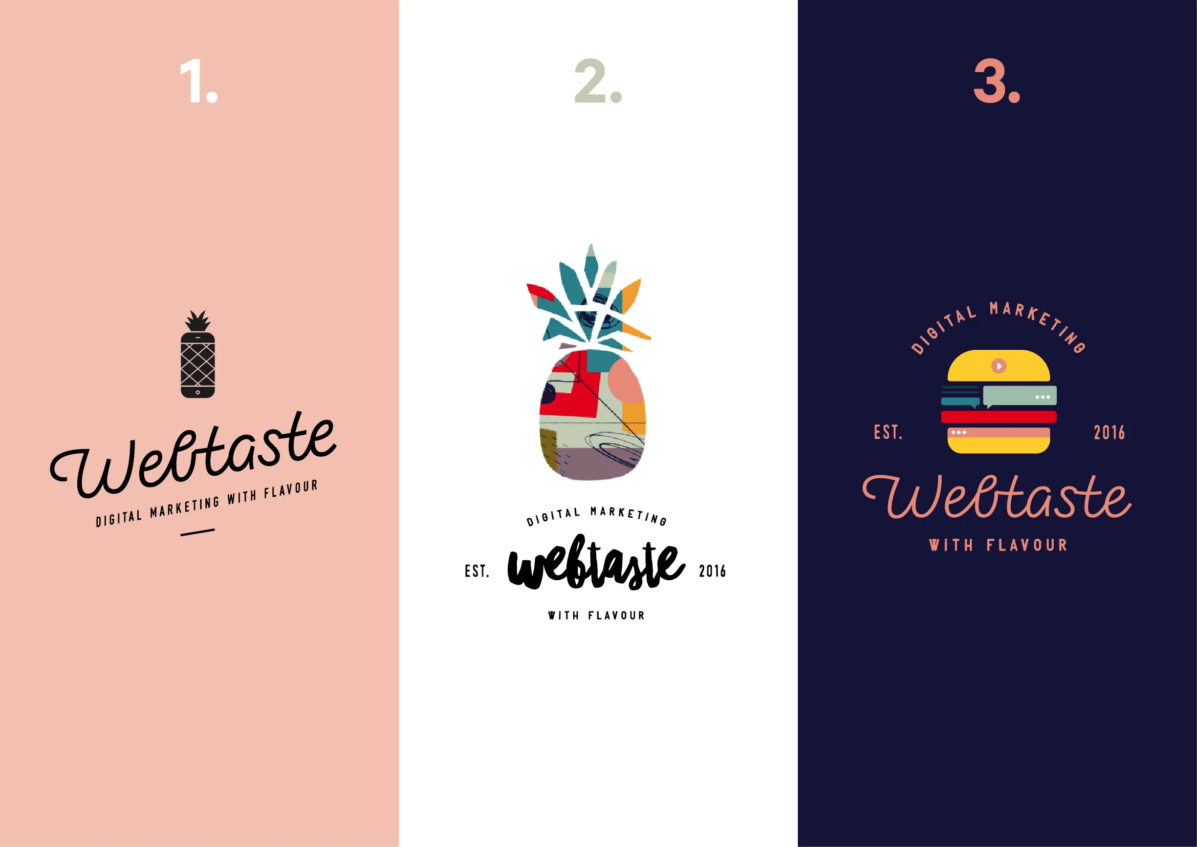
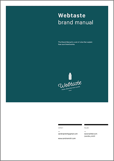
The design process is then split into 3 phases: 1. 3 possible ways are presented with the strategy behind. 2. one route will be refined 3. a manual will be created to be able to work with the outcome.
So to keep it simple - here you see the 3 versions for webtaste. (summarized)
I can't reveal the project brief or the positioning but I think it is fun to see the versions that came to be - all based on the same insights. As well as the manual the captures the most important guidelines.
ps: this is a great example of a WOW collaboration - the custom font was drawn by ma former intern tamara, that now is part of the WOW CREATIVES family, setting out to do a master in typography this autumn